Smoothly

Outsource the small stuff to one fixed person, in one place.
ROLE
Product Designer · End-to-end
SCOPE
Web app · 200+ screens · Client + Assistant + Admin
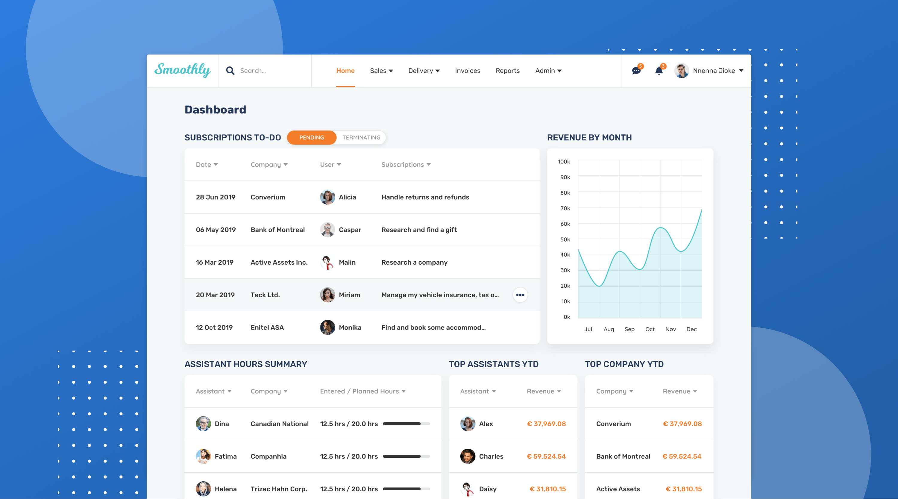
Smoothly — hero cover of the shipped product

OVERVIEW

Smoothly lets clients hand routine, repeatable work to a fixed remote assistant, then collaborate, communicate, create, manage and report on those tasks in one place. I came on as the solo designer to take a raw idea to a shippable MVP across three roles: client, assistant, and an admin who can act on behalf of either.

THE PROBLEM

The pitch sounded simple (outsource small tasks), but the moment we started brainstorming it ballooned. Each of the three roles needed to create, manage and report on work, and the admin had to be able to do any of it on someone else's behalf: mark a task complete after a phone call, or step into a stuck collaboration. Designed naively, that overlap becomes three bloated apps fighting over the same screens.

THE APPROACH

I owned the whole arc solo: refining the founder's idea, building a persona for each role, then separate user flows, low-fidelity wireframes and clickable prototypes for client, assistant and admin. I tested those prototypes with the founder and real users, and the wireframes went through several revision rounds before a single pixel got polished. Visual design followed the client's existing brand guidelines and Font Awesome icon set, kept deliberately modern so it never felt dated.

DESIGN PROCESS

Solo, and end-to-end.

Seven stages, one designer, one coherent product across three roles, from discovery through handoff. Keep scrolling to walk the process step by step.

SCROLL TO EXPLORE
THE DESIGN PROCESS
01 02 03 04 05 06 07
Discovery
01 / 07

Discovery

Started by unpacking the real pain points: what users actually struggle with and how they get things done today. The brief sounded simple, but the moment I started brainstorming, the surface area of features needed to solve it ballooned. A competitor audit of how other platforms connect clients with assistants gave the work direction and exposed gaps worth designing into.

User Personas
02 / 07

User Personas

I used personas to stay anchored on the users and stop the team's appetite for features from outrunning what users actually wanted. Three personas, one per role: Client, Assistant, and Admin, each with its own goals, frictions, and context.

User Flows
03 / 07

User Flows

With the personas in hand, I mapped a complete flow for each role (Client, Assistant, and Admin) so every path through the product was deliberate, not improvised. Three roles meant three different worlds; each got its own flow rather than being squeezed into a shared template. Shown here: the Client flow.

Wireframes
04 / 07

Wireframes

Low-fidelity wireframes for every screen across all three roles, drawn in Sketch and stripped of any visual decision. Each one captured structure, content hierarchy and the edge cases the flows alone couldn't surface. The intent was to pressure-test the shape of the product on paper before a single pixel got polished.

Testing
05 / 07

Testing

Every screen wired into a clickable prototype and tested with the founder and real users. The wireframes went through several rounds of revision before a single pixel of visual design.

Visual Design
06 / 07

Visual Design

~200 polished screens across the three roles, designed in Sketch and built on the client's brand guidelines and Font Awesome icon set. The visual treatment stayed deliberately modern so the product wouldn't feel dated the moment it shipped. Every state, edge case and empty view got the same care, because consistency at that scale is the difference between a designed product and a stitched-together one.

Handoff
07 / 07

Handoff

Final design files plus a clickable prototype the client owned outright. Hover, dropdown and micro-interaction animations were specced so engineering knew exactly how it should move.

OUTCOME

A three-role product that read as one coherent thing instead of three apps fighting for the same screens. Around 200 polished, tested screens shipped as a system the engineering team could build straight from.

SELECTED WORK

A walk through what the prototype was built from, and the polished screens that shipped.

User Flow

A complete flow for the Client role, mapped before a single screen got drawn. The Assistant and Admin roles followed the same method, each given its own world rather than being squeezed into a shared template.
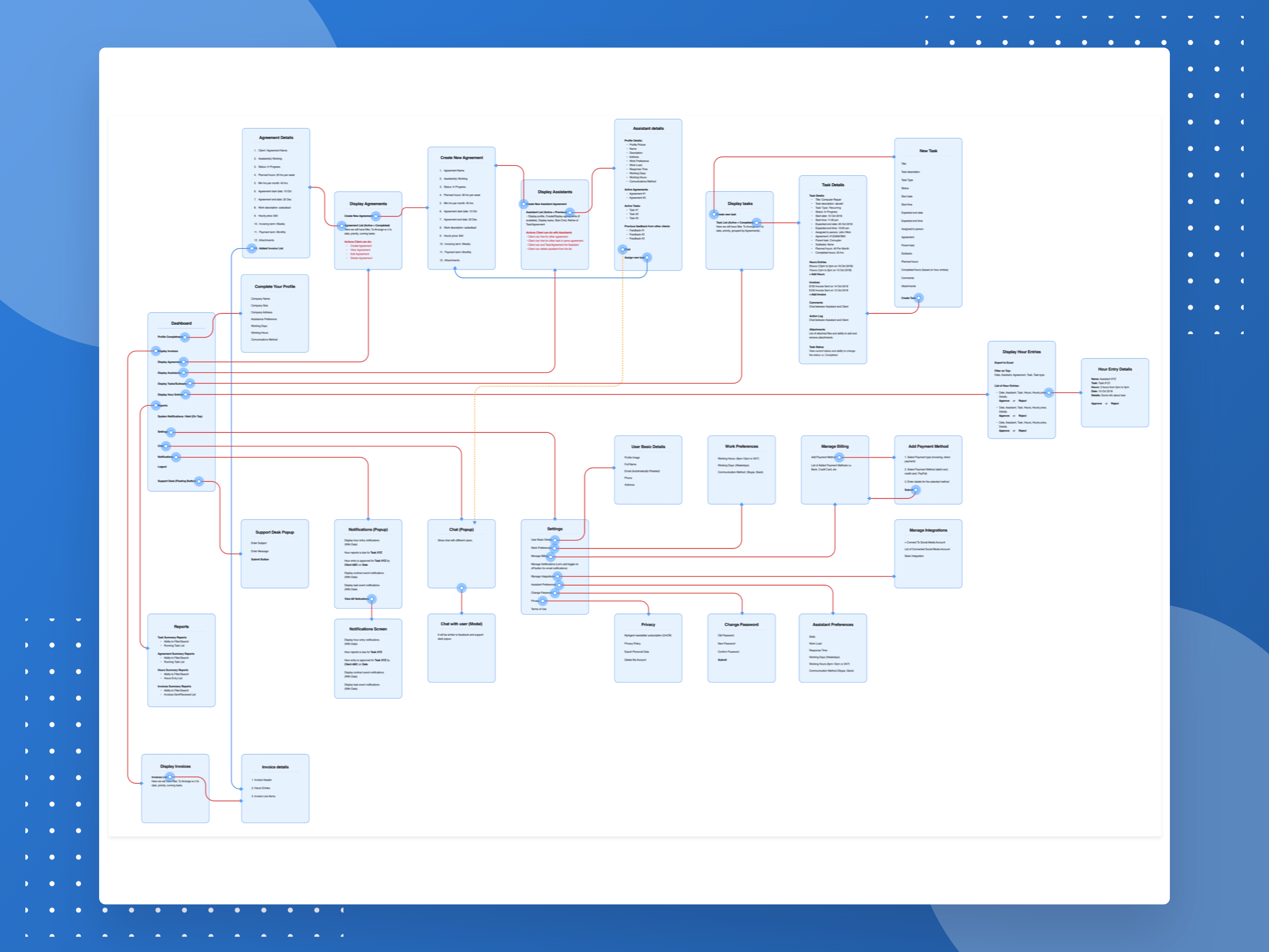
Client role complete user flow
Client · Complete role flow

Wireframes

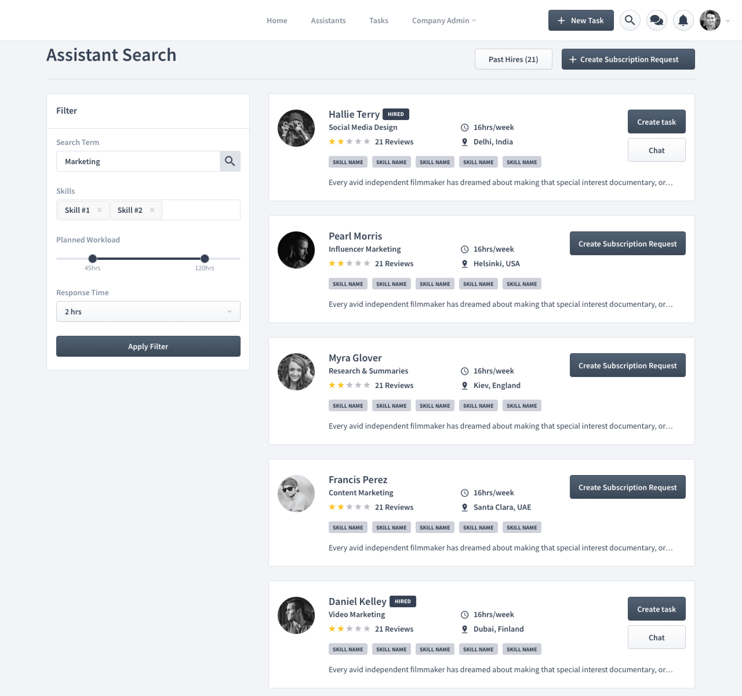
The low-fi screens the clickable prototype was built from. These went through several revision rounds with the founder and real users before any visual design started.
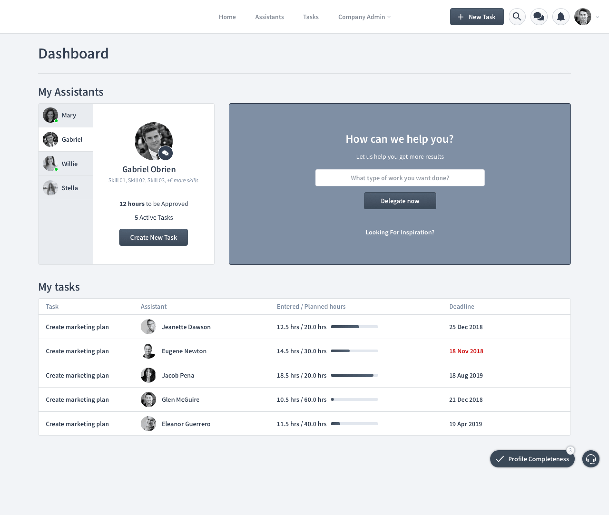
Dashboard wireframe
Client · Dashboard
Assistant search wireframe
Client · Assistant search
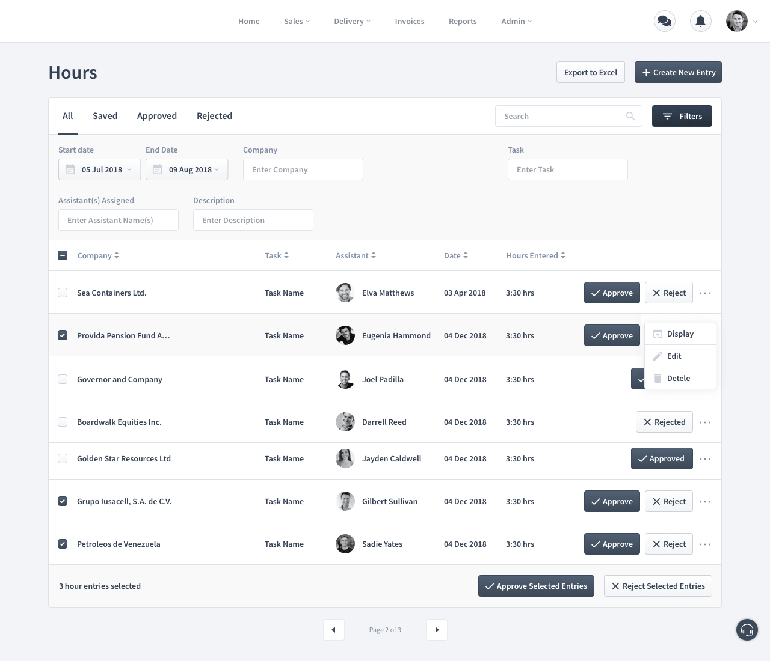
Hours and approvals wireframe
Admin · Hours & approvals
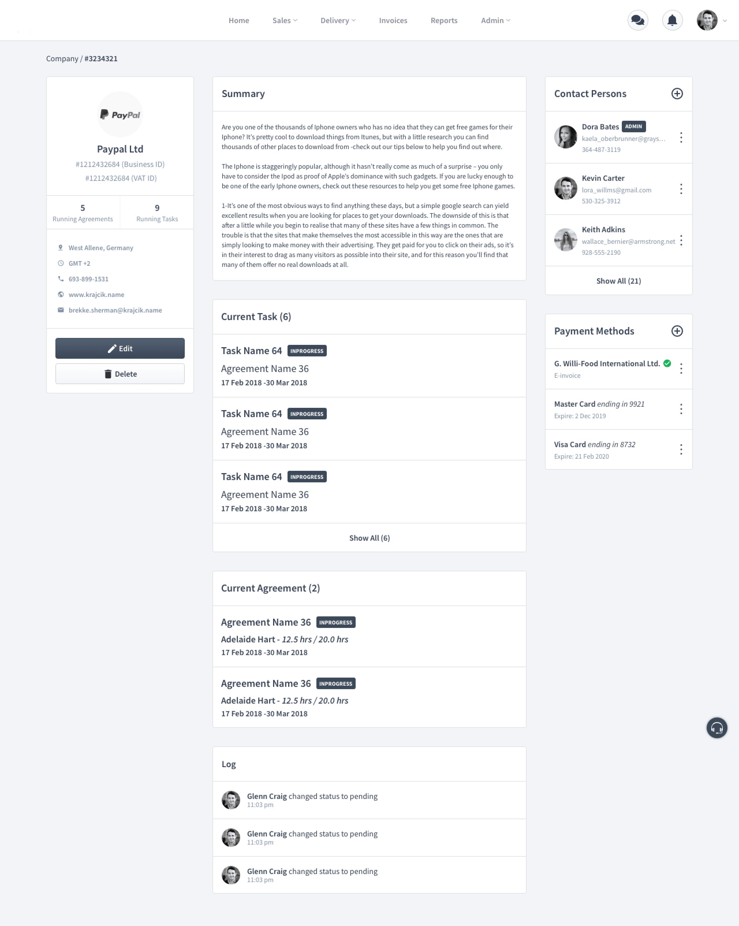
Company detail wireframe
Admin · Company detail

Final UI

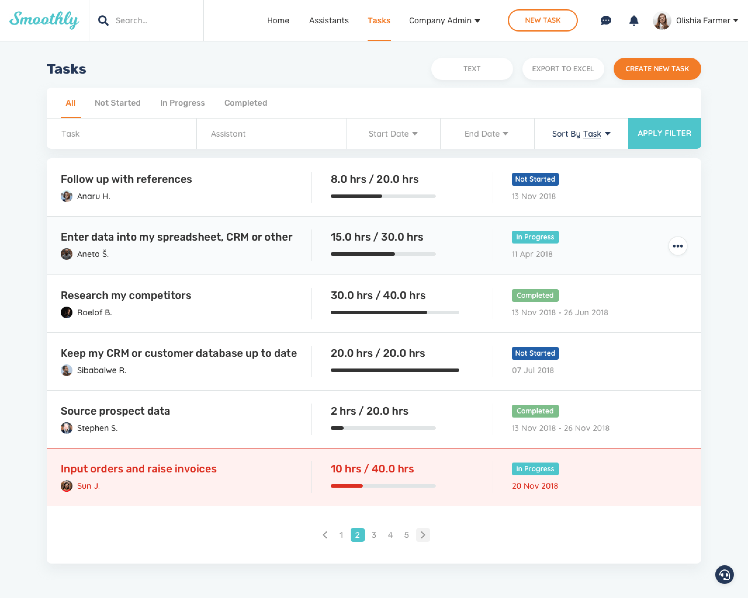
~200 polished screens across the three roles, built on the client's brand guidelines. A selection of the screens that did the heaviest lifting in the product.
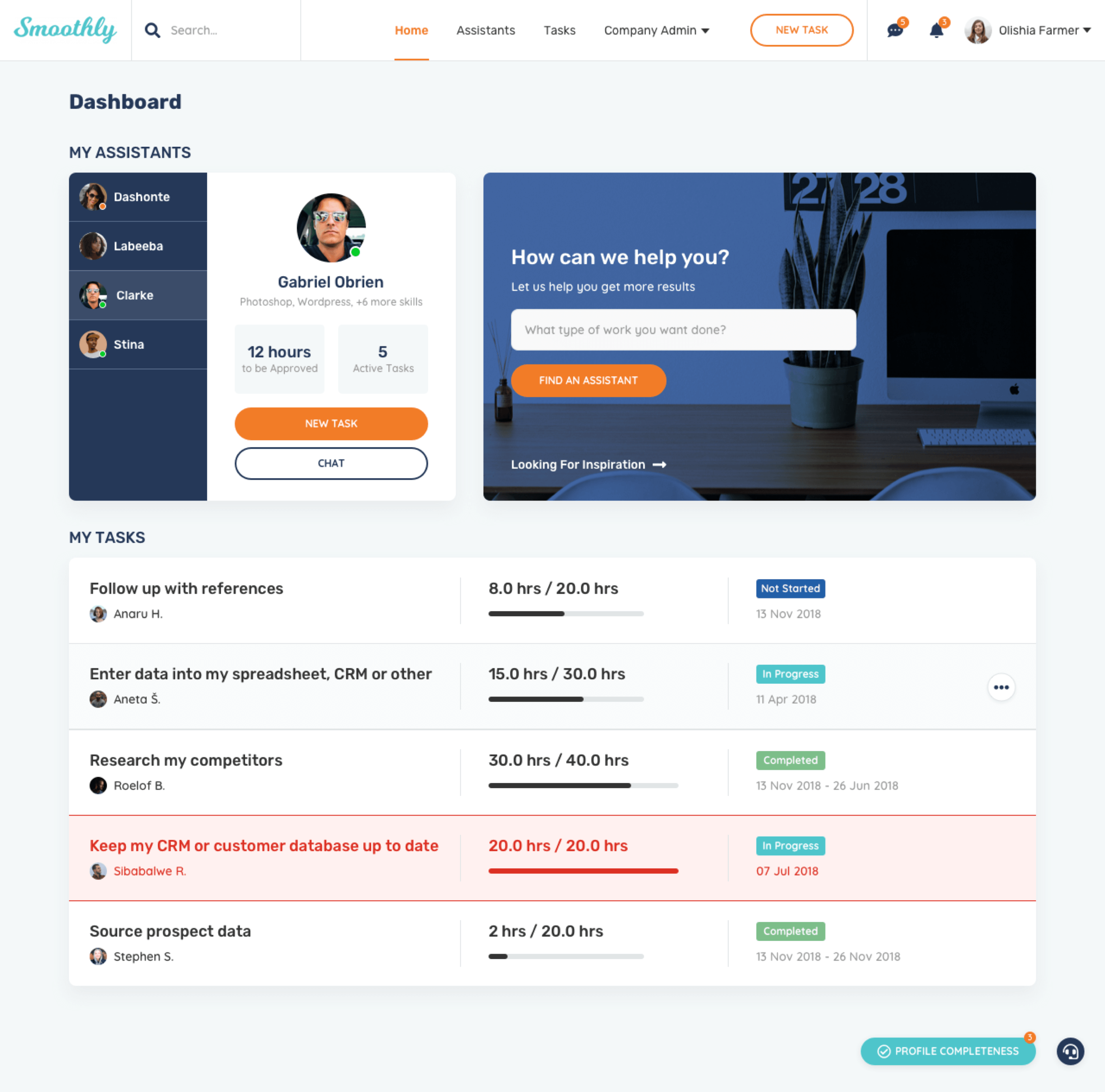
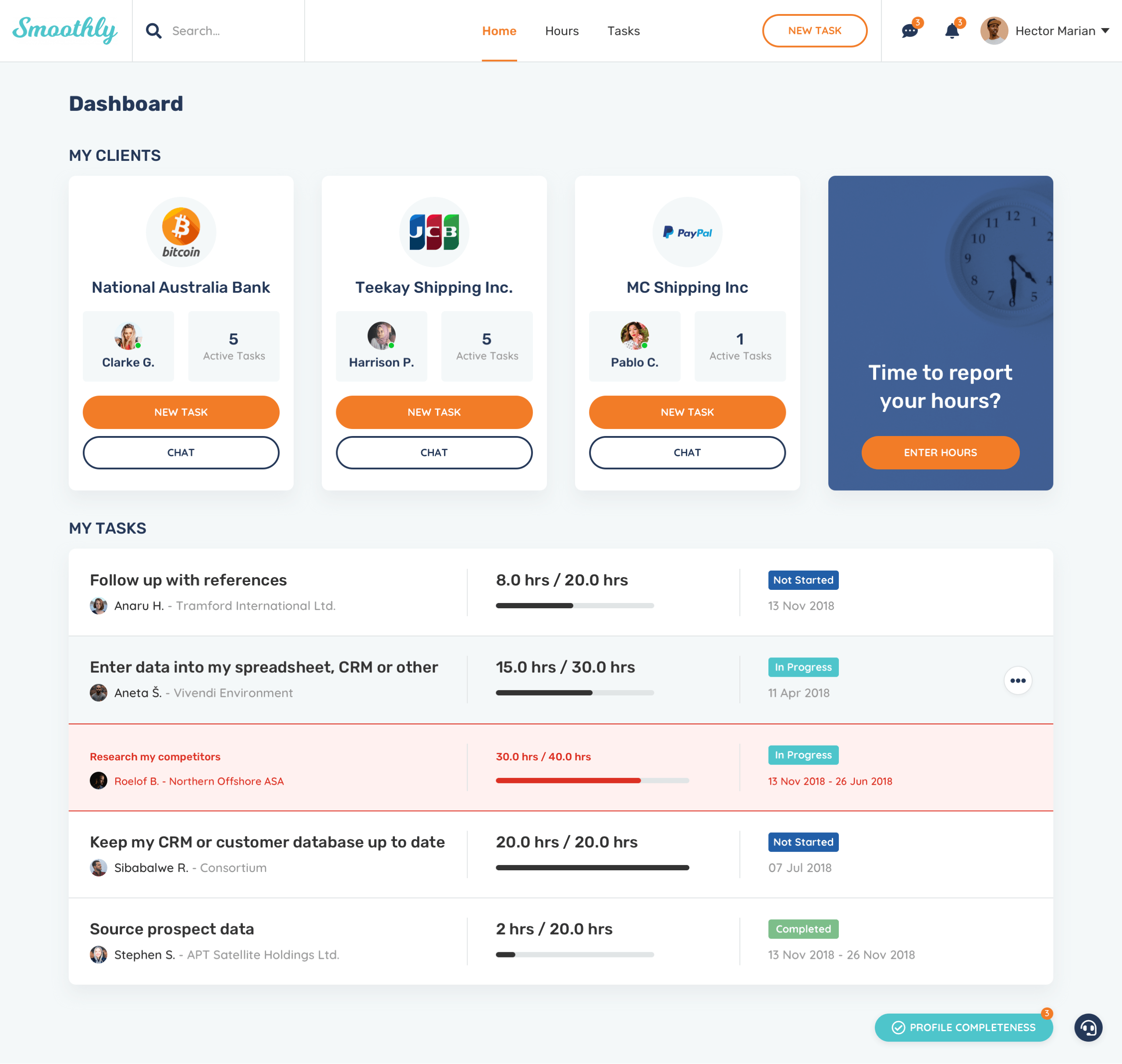
Client dashboard
Client · Dashboard
Task list
Client · Task list & progress tracking
Assistant clients and hours
Assistant · Clients & hours
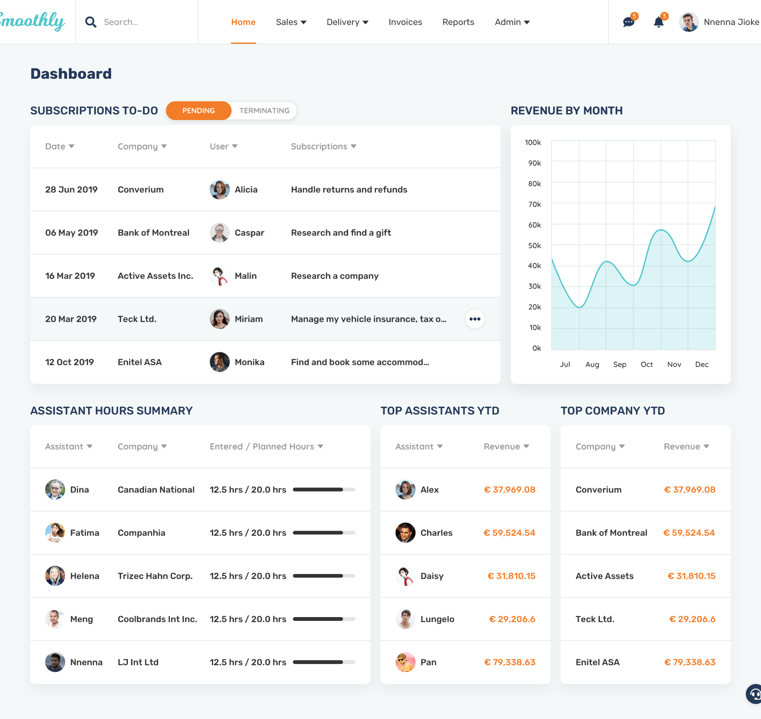
Admin operations dashboard
Admin · Operations dashboard
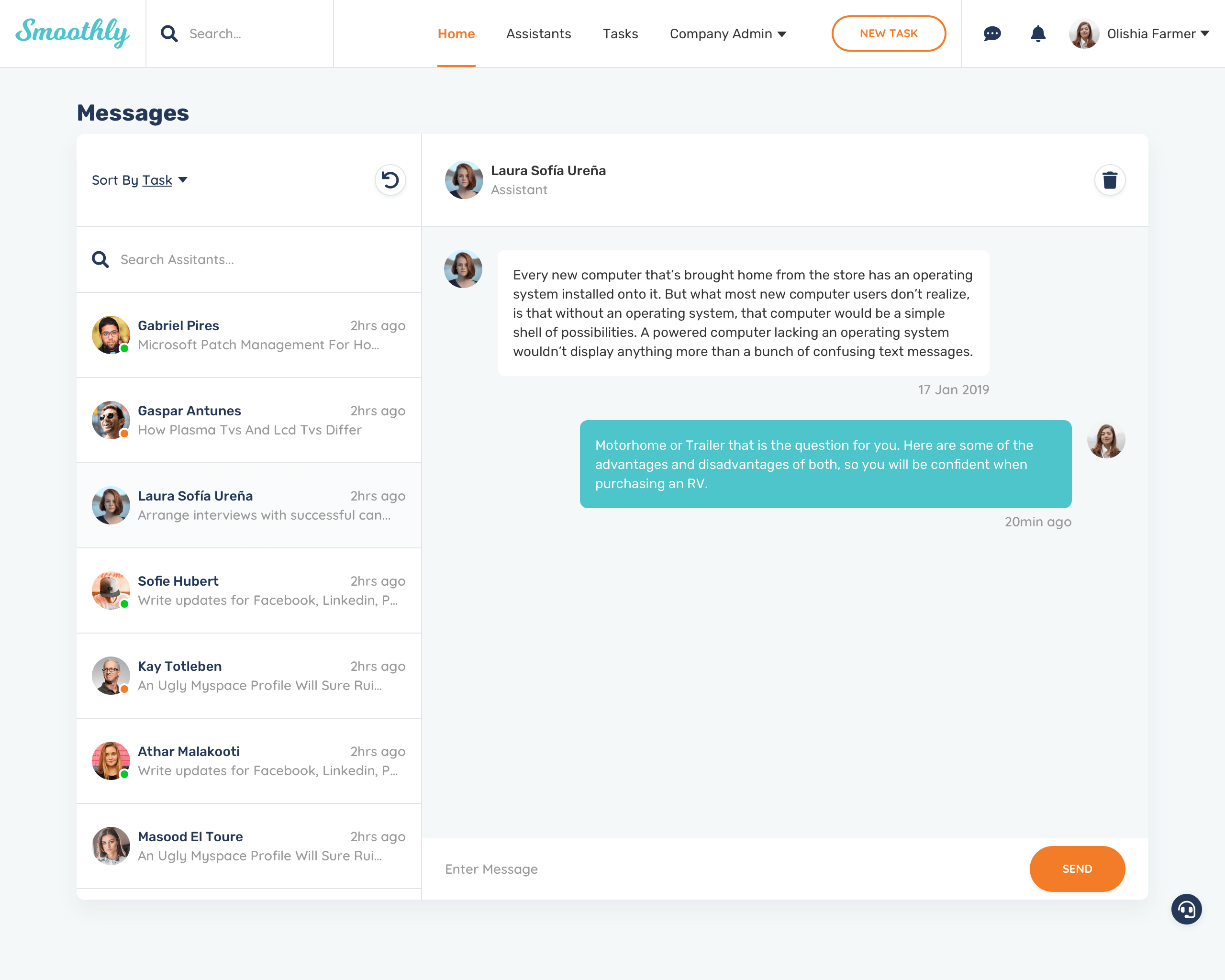
Admin user management
Admin · User management
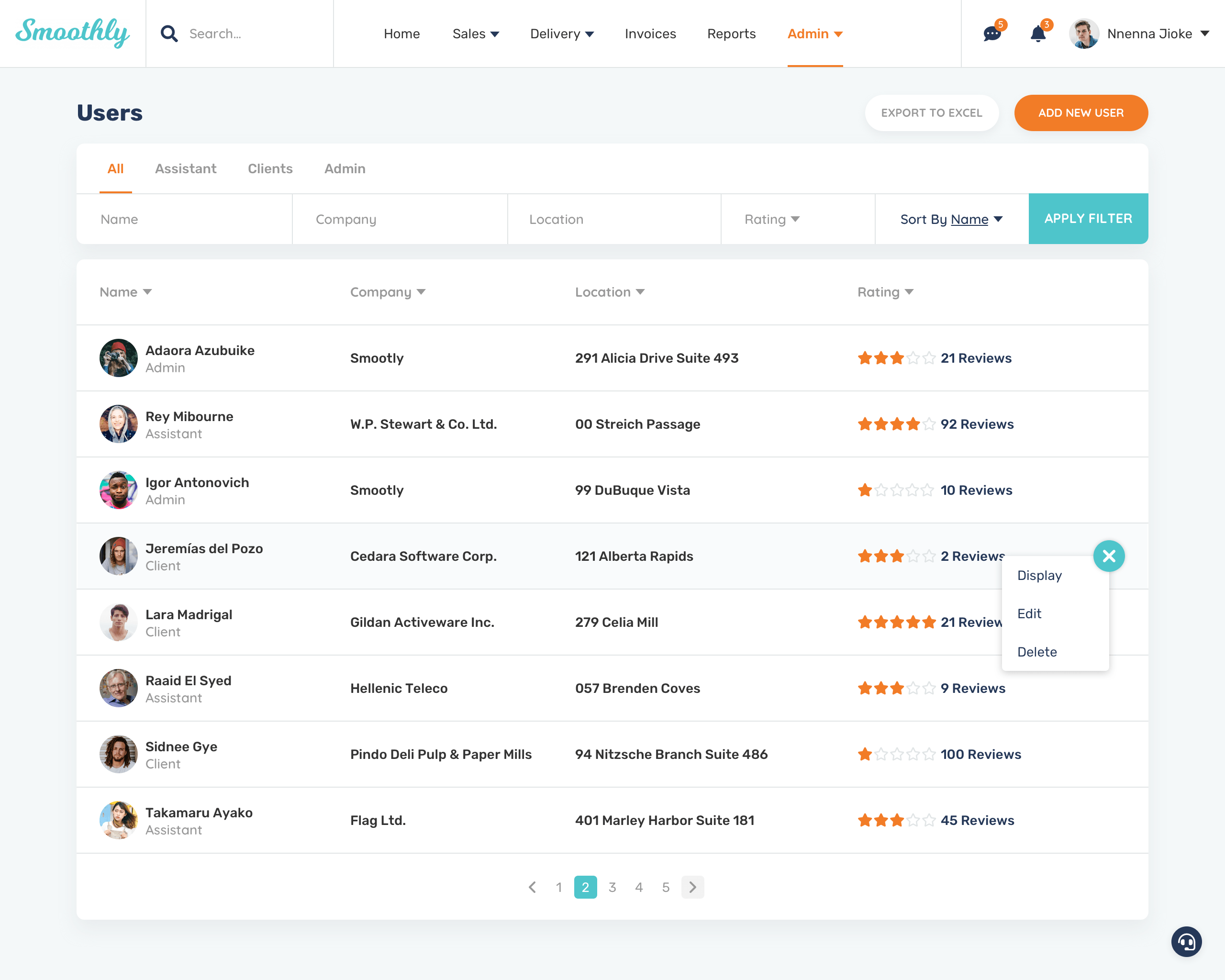
Messages and chat
Assistant · Messages & chat

Working with Asad was truly a pleasure. He understood the brief from the start, giving guidance and approaches based on his experience. He exceeded my expectations with the deliverables, providing more than what was asked, which I was delighted with. I now have my go-to UX person for all future projects!

Mikko · Founder of Smoothly

Have a product like this on your plate?

That kind of end-to-end complexity, or a different tangle you need someone to sit with from strategy to handoff. Tell me where you are and I'll tell you how I'd help. Replies within 24 hours.

me@asadamalik.com
REPLIES WITHIN 24 HOURS
NEXT CASE STUDY
StructionSite
ENTERPRISE · ADMIN
See the work